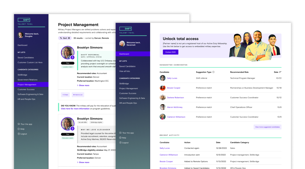

Creating a Talent Marketplace
Proving that companies would pay for access, Shift’s Talent Tool would need to rapidly evolve from a rough proof-of-concept into a sophisticated recruitment platform. By committing to a user-driven approach featuring partner interviews and rigorous feedback loops, could the company meet the needs of the market?
Talent Tool | 2021 - Present
Multi-sided marketplaces are always chicken-and-egg exercises. One half of the equation always trails the other when both are equally important. With Shift, the Candidate App work illuminated that ingestion was the organization’s initial focus. That data needed a delivery mechanism and with paying users in place, we simply needed to execute.
Rough on virtually every edge, the initial Talent Tool made few capability claims beyond providing paid users access to talent. Still, the company prioritized ending the practice of throwing manual labor tasks, and that included marketplace matching. With the applicant funnel leakage of the Candidate App addressed, my attention shifted to where the company made money and build a sustainable tool that could scale.
Objectives
- Determine how existing partners are using the tool
- What are successful partners doing differently?
- Align feature requests with partner observations
- Tune current content to boost signal, remove noise
- Fix anything that is clearly broken
Research and Discovery
The reality of product development is harsh; many products never see the light of day due to scope creep. Yet, the Shift team demonstrated resilience by building a lean tool with a clear objective: populate a marketplace and attract paying customers.
The Challenges at Hand
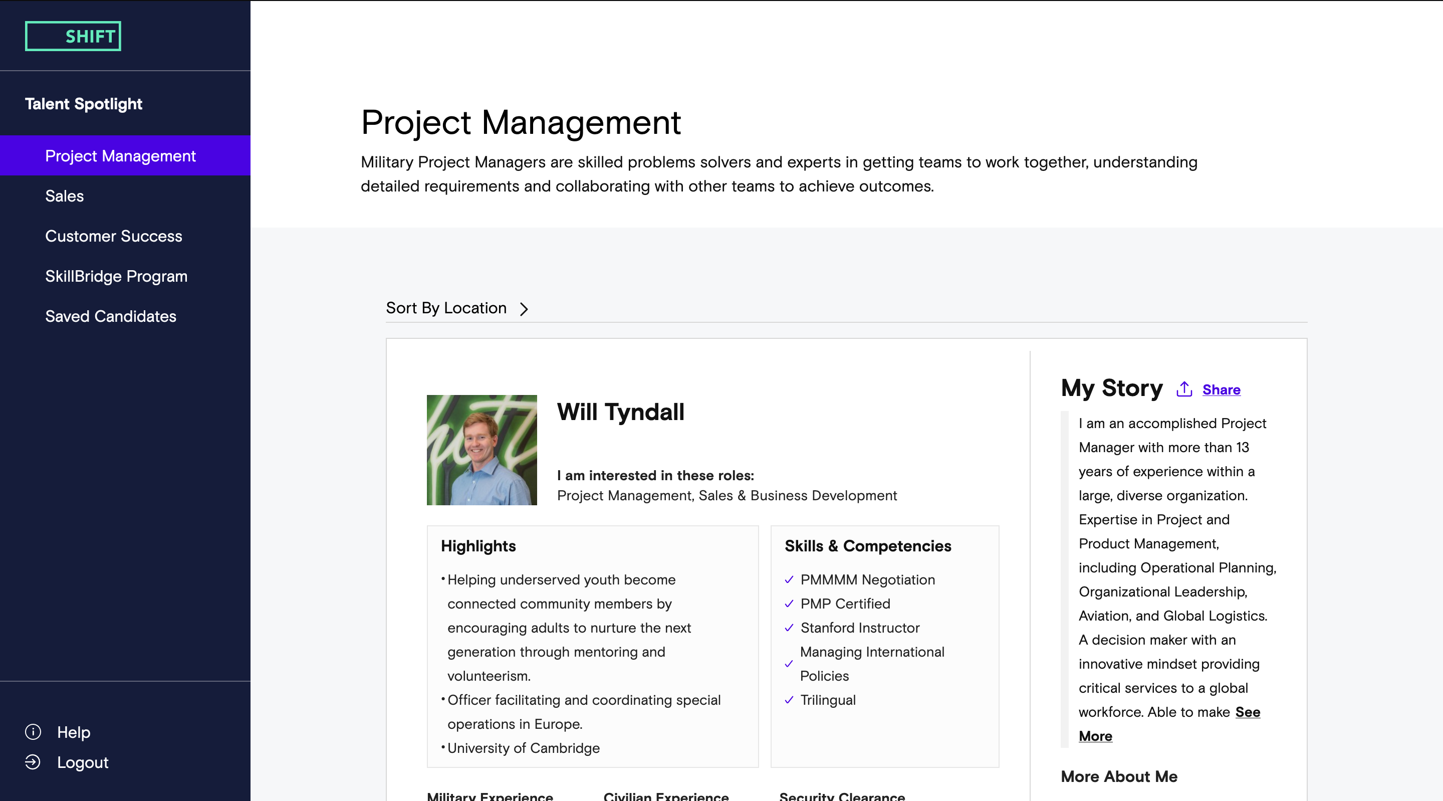
Despite this initial success, numerous challenges lurked beneath. The foundation was based on an unscalable backend due for removal. Astonishingly, the product remained functional even without a user account creation mechanism. A glaring concern was the manually-intensive display of candidate information. We were left pondering: did our paying customers genuinely value this effort?
Stepping Outside the Echo Chamber
Recognizing the need for fresh perspectives, we initiated conversations with our partners. Teaming up with fellow consultant Luxi (Lucy) Huang, the monolithic perception of Shift’s partner base began to splinter. These dialogues revealed a spectrum of expectations, leading to vital discoveries about company structure, workflow integration, and hiring experiences. Such insights promised to ripple across various departments from engineering to sales.

Rapid Prototyping & User Feedback
Identifying emerging patterns, we dived into rapid prototyping. Though we kept prototype testing towards the end, our partners were keen to critique upcoming features. This proactive approach was perceived positively, painting us as a forward-thinking entity striving to enrich customer experience. Many suggestions poured in, some hard to implement due to dependencies. However, we noticed some of our early adopters filling product gaps manually. Incorporating these functionalities became our immediate goal.
The Evolution of Enhancements
Every proposed enhancement had its unique journey. Some paths were straightforward, while others demanded patience. Fast-forward to 2023, our partner interviews have cemented into a bi-annual ritual. The once rudimentary data display for a select group has matured, boasting enhanced customization and automation, thanks to the invaluable feedback from these recurrent sessions.

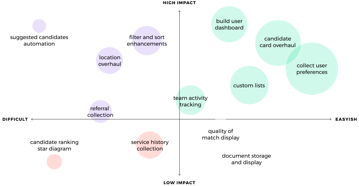
Enhancement priorities
- Creation of saved candidate lists.
- Ability to track team activity regarding a candidate.
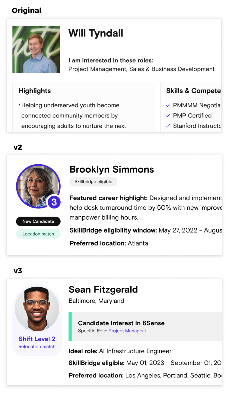
- Refinement of candidate card and profile display.
- Updated filter and sort capabilities.
- Complete overhaul of location usage.
- Collection of user preferences.
- Creation of user dashboard.
- Automated display of suggested candidates.

Navigating the Terrain of 'Location'
Every product designer knows the allure of proximity. Being close to users often breeds a belief that we comprehend their needs implicitly. This well-intentioned pitfall is one I’ve traversed before. Such was the dilemma at Shift.
Founder’s Perspective vs. User Reality
Shift’s founders, seasoned with military backgrounds, felt a kinship with their target demographic: servicemembers seeking employment. They resonated with the candidates’ nomadic military lives and their newfound liberty to choose a residence post-service. This insight led to the 'Preferred Location' feature during the application process. But was this truly a universal sentiment or a projection of the founders' experiences?
Early Indications & Stakeholder Feedback
The 'Preferred Location' concept, though flagged by stakeholders, went unnoticed in initial partner interviews. Perhaps because the original design omitted any location reference. Without concrete feedback, the company doggedly pursued a feature so close to the founders’ hearts.
The Crux of Location in Conversations
As we rolled out updates and engaged in more interviews, location became an epicenter of dialogue. Teaming up with Shift’s new PM Gabrielle Castaldo, it was evident partners were baffled. They were less concerned about where a candidate aspired to be and more about their current location. The reason? An aversion to relocating candidates. This highlighted an educational gap — many veterans could be relocated by their military branch, a boon if both parties were informed.
Redefining the Location Feature
The initial location sort was cumbersome, lacking user feedback. We had to find middle ground, respecting the founder's vision and addressing the partners' concerns. Our solution: retain the preferred location but emphasize the current one, using both for sorting. This tweak preserved the founder’s essence while catering to our partner’s primary need.
Future Horizons
There's still a cache of enhancements for the location feature awaiting exploration. Yet, they remain on the back burner, as our agile team confronts a slew of other pressing challenges.

From Product Gaps to Noteworthy Gains
Evolving Customer Interaction
In the early stages, Shift's product was riddled with gaps, demanding the customer success team to frequently intervene, guiding users through the platform. However, as we meticulously addressed concerns voiced during user interviews, a transformative shift occurred. By the latter half of 2022, not only did the nature of user requests evolve, but their frequency also diminished. With enhanced visibility into team activities, users found themselves less reliant on Shift's support. This newfound autonomy led to a surge in customer satisfaction.
A Remarkable Turnaround in Retention
Attracting sign-ups for Shift was always our forte. Yet, securing client renewals presented a formidable challenge. As the first half of 2022 unfolded, retention figures were disheartening, plummeting below 50% and showing no signs of respite. But with the rollout of high-priority features, a remarkable turnaround ensued. By December, our retention rate witnessed an uplifting boost, ending 20% higher than July's figures.