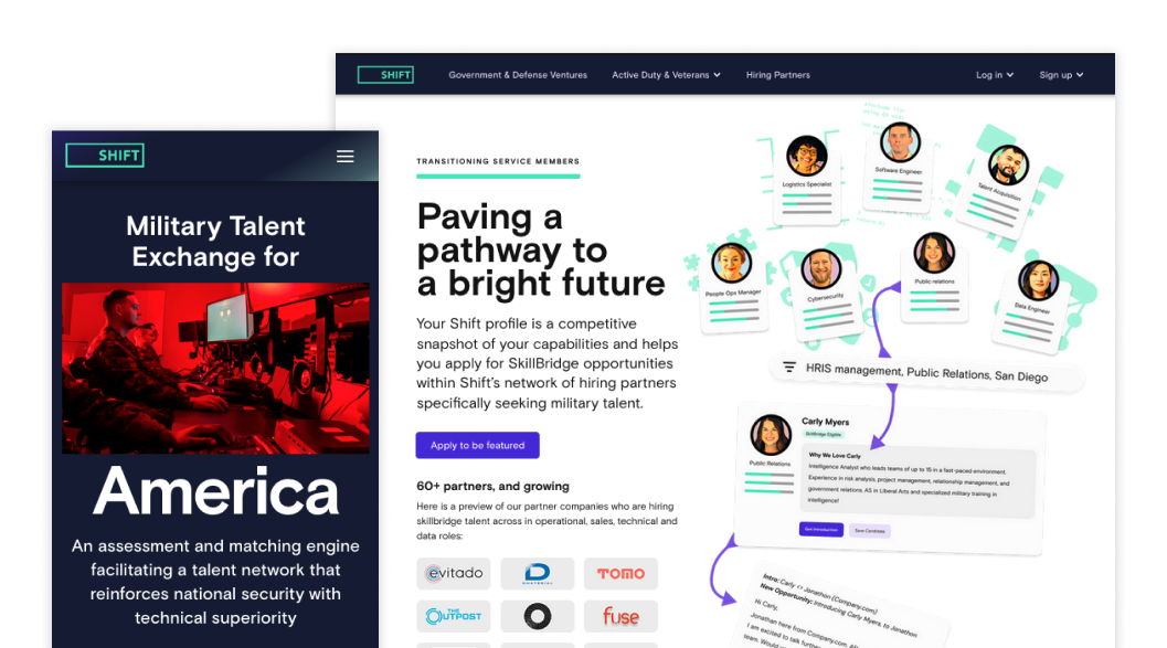

Growth Communication
Maintaining our connection with the original Shift.org audience was essential, but we needed to broaden our scope if the organization aspired to reach its growth objectives.
Shift.org | June 2023 - August 2023
In the multifaceted world of business and technology, no company can afford to address a single, monolithic audience. The requirement to resonate with different user groups is a universal challenge, often demanding tailored solutions. Shift.org embodies this complexity, facing the unique task of bridging the gap between military members and two distinct experiences that lead to divergent outcomes.
Enlisted Military Members
Engaged with a sense of purpose and personal growth, these individuals seek knowledge and expertise from private industry leaders. Their objective is to leverage this learning within their respective military branches, fostering enhanced skill sets and leadership qualities.
Exiting Military Members
As they transition from military service, these users focus on securing connections with partner companies. The hope is to secure full-time employment, thus enabling a smooth shift from their military roles into the civilian workforce.
Adding to the intricacy of Shift's challenge is the presence of powerful gatekeepers at the government level, who, despite their well-intentioned nature, possess limited understanding of the programs offered and even less familiarity with Shift itself.
The redevelopment of Shift.org was not simply a redesign; it was an intricate choreography of content, strategy, and user experience. The updated site needed to connect with a diverse set of user groups and address their individual concerns. Done well, these updates would stretch beyond mere communication and become a valuable tool in aiding the growth funnel.

Beyond Candidates – A Platform Strategy Change
In the wake of the pandemic, the company embarked on an aggressive recruitment strategy, fervently seeking to attract as many military members as possible to feature on the platform. Given that private industry formed a substantial part of the company's economic foundation, it was logical to cultivate a robust repository of military talent for hire. To achieve this, the platform needed to become a nexus where numerous individuals found value and engagement.
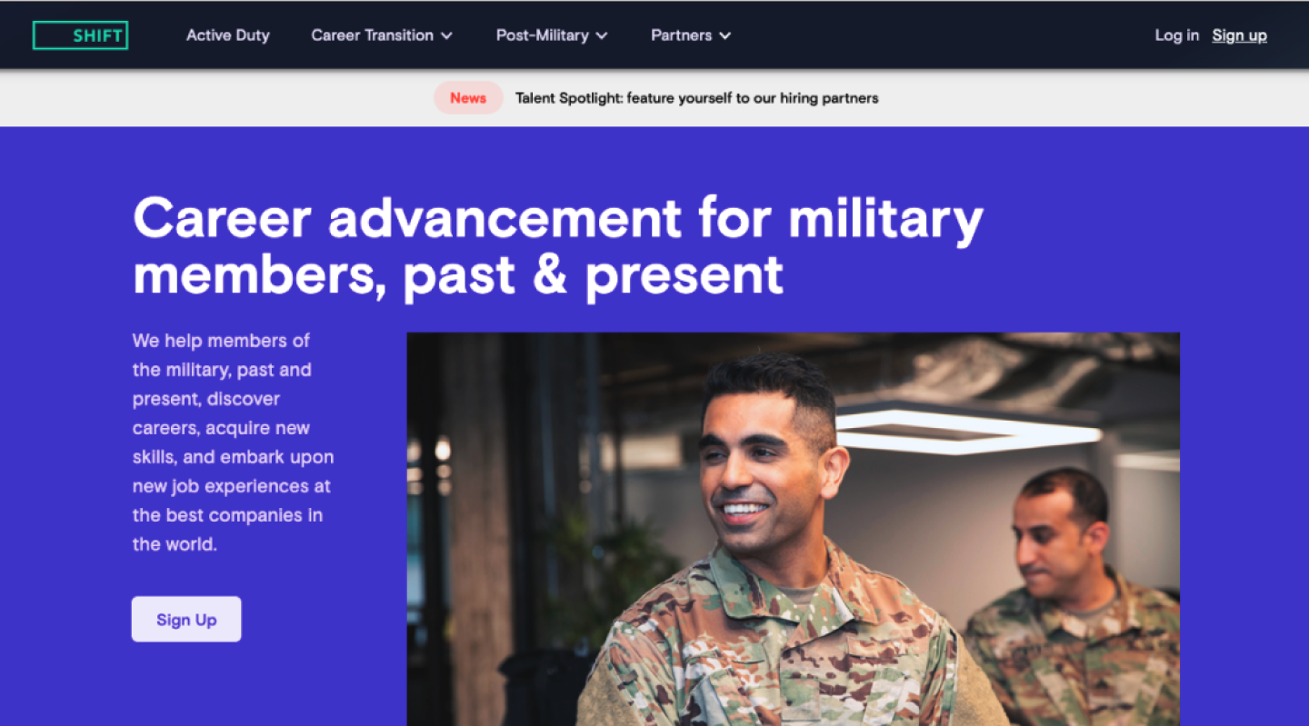
The repositioning work in 2021 mirrored this targeted approach, with pages meticulously tailored to various stages of military affiliation, including enlisted members, those exiting service, veterans, spouses, and national guard members. This segmentation offered an intentional alignment with users, as they could navigate to programs reflecting their unique identities and needs.
However, this focus on recruitment revealed an imbalance in the overall strategy. The relentless pursuit of military talent overshadowed other critical facets of the platform — partnerships and government approval. If Shift was going to be successful, we needed to better support our Partnerships Team and find a way to address the permission barriers that were stifling our access to enlisted military members.
Objectives
- Reach audience directly influenced by the DoD
- Provide clarity on partnership benefits
- Consolidate service member pages to simplify discovery
- Leverage growing alumni recommendations
Addressing motivations
While military member recruitment was a non-issue, the company’s focus naturally transitioned to the weak link: government users and hiring partners. Both parties required a tailored approach but the purpose was the same – to set clear and accurate expectations of the opportunity.
Government Users
Understanding the needs of this segment called for highlighting Shift’s alignment with the Department of Defense (DoD). Government users needed assurance that the company was not only operating with direct endorsement from the DoD but also committed to the professional development of enlisted members. The emphasis was on delivering individuals back with enriched knowledge, rather than offering a mere exit path into the private sector. This distinction was vital in establishing trust and demonstrating alignment with the broader goals of military service and development.
Hiring Partners
For the businesses looking to hire military talent, Shift’s proposition was twofold. The company could either provide access to highly-skilled personnel just entering the market or facilitate the integration of enlisted personnel into their teams. Both approaches offered significant competitive advantages, particularly for companies aiming to engage with the DoD. The message here was one of opportunity, collaboration, and strategic alignment with business goals.
Renewed focus on participants and internal partners
By clearly articulating the value proposition for both government users and hiring partners, the company reinforced its support for military members seeking to join the program.
Additionally, the targeted communication and alignment of expectations helped alleviate staffing bottlenecks. By offering clear pathways and articulating the benefits for different stakeholders, the team could navigate partnerships more effectively.
In essence, the “Why” transcended mere recruitment. It shaped the narrative around expectation, alignment, and value, creating a compelling case for diverse stakeholders. The deliberate tailoring of information for different user groups illustrated Shift's ability to understand, communicate, and deliver on specific needs, enhancing both trust and engagement across its ecosystem.

The gist of the story
In my early days as a print designer, I encountered the challenge of connecting with an audience from a distance. The expanses of space necessitated abandoning subtleties and embracing clarity and simplicity as the main design principles. This experience has striking parallels with the way technology and marketing sites operate today.
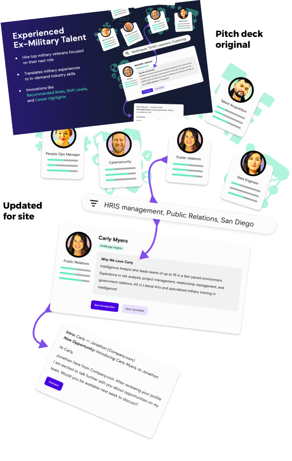
Most tech marketing sites opt for approximations of their tools, focusing on the narrative rather than a literal interpretation. This approach acknowledges the reality that while some users crave detailed insight, many are navigating the site to discern whether they see a potential solution to their problem. With this critical insight in mind, the reimagined visuals were meticulously crafted to serve two essential purposes:
Convey Platform Functionality Without Overwhelming Specifics
By focusing on the essence rather than finer details, the visuals explain how the platform works in an approachable and relatable manner without inundating the user with unnecessary details. The final designs used (displayed in the right rail) were first tested in earlier pitch decks used by our fundraising teams and later modified based on the reception those initial versions received.
Reflect the Marketplace's Core Persona – The Candidate
The visuals were designed to resonate with the candidate's experience and aspirations, serving as a mirror reflecting their journey and potential.
A key innovation was the strategic use of AI to infuse the candidate images with a cohesive and branded appearance. Recognizing the original imagery's limitations, I deployed a combination of AI tools, including Prisma, Remini, and Firefly, to align all candidate photos. This creative approach not only elevated the visual quality but also unified the site's aesthetics.
The success of this visual strategy was not confined to the site itself; it resonated across various channels, finding its way into marketing materials, pitch decks, and social media platforms. The approach became emblematic of a new visual language that transcended mere aesthetics, enhancing user engagement and aligning with the platform's core values and mission.

Embracing Automation
In the fast-paced environment of a small team, bottlenecks are more than mere inconveniences; they can threaten the momentum and success of new endeavors. Recognizing this, it becomes imperative to identify opportunities to automate processes where possible, transforming obstacles into efficiencies.
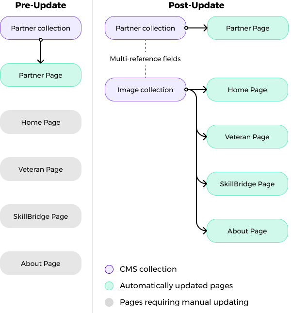
One such challenge presented itself in the form of a recurrent complaint related to the old site's representation of company partnerships. Frequent changes led to visuals falling behind, and the underlying issue was rooted both in internal reporting and the manual process employed in creating these displays. Updating the site became a cumbersome task, necessitating modifications on five different pages each time a change occurred.
To remedy this problem, I enhancing the company's existing partner Content Management System (CMS). By introducing a few additional fields and implementing a sorting mechanism by type, we were able to transform a formerly laborious task into a seamless process:
Add, Archive, Update
Partner companies could now be effortlessly added or archived as required, ensuring that changes would be automatically reflected across all relevant pages.
Unified Control
The disconnected displays were replaced by a centralized system, providing a coherent method to manage visuals in line with the latest partnerships.
While such automation might not have an immediate or direct impact on the bottom line, the value it brings is in freeing up valuable time for the team responsible for maintaining the site. In a setting where time is a precious resource, it should not be squandered on tasks as mundane as wrangling logos.
